LEBUA AT STATE TOWER
Re-FINE the identity and environmental design for the iconic quintessential Bangkok venue as the world’s first vertical destination – where best-meets-best fine-dining and bars, each with a million-dollar vista, are stacked up all in one exquisite tower.
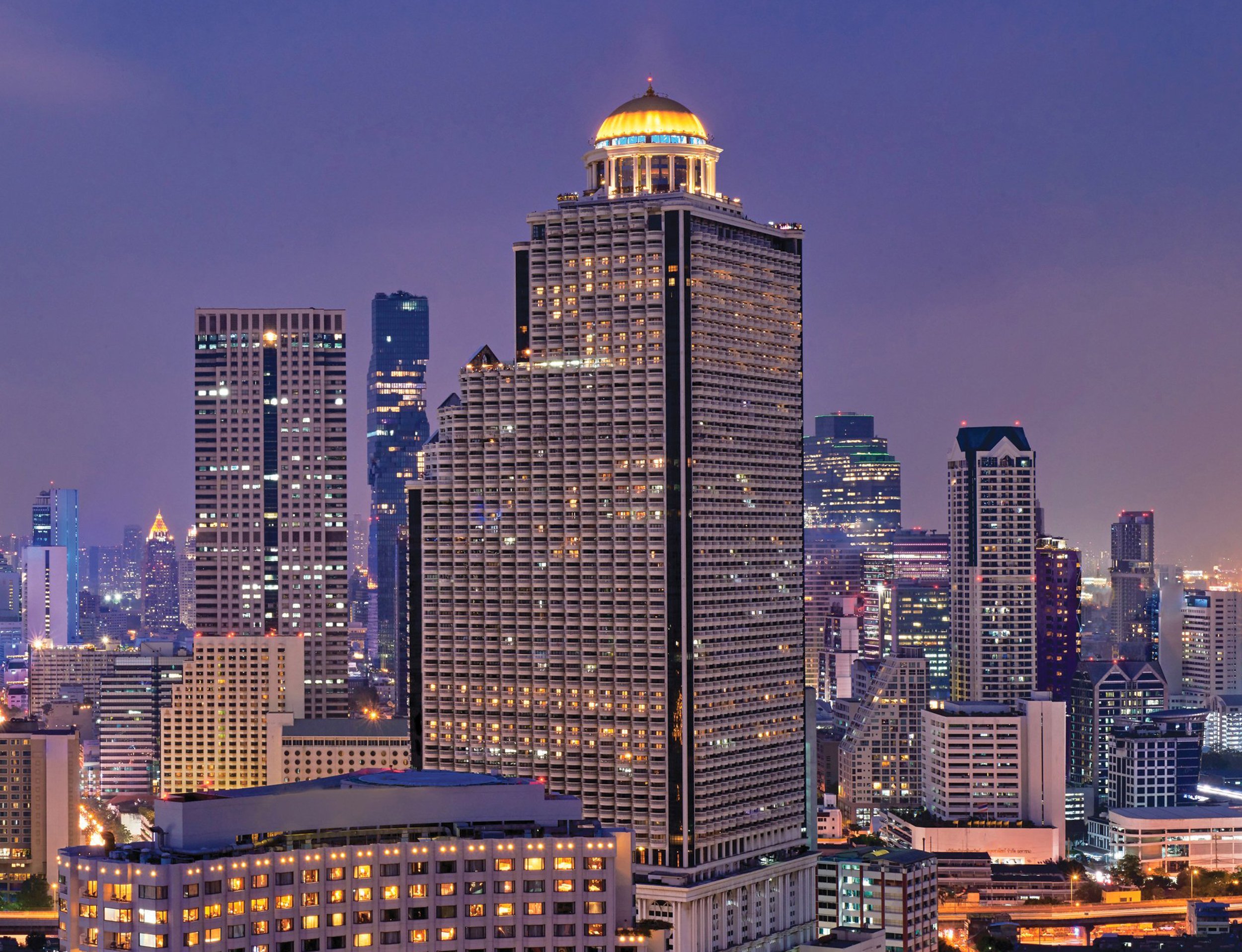
LEBUA at State Tower, one of the best luxury hotels in Bangkok that has always been the get-go place for gatherings, whether it is for business or pleasure, for almost two decades, has now reopened its doors to welcome back its honourable guests. Featuring up to ten bars and restaurants, two of which are Thailand’s two-Michelin-star restaurants, Mezzaluna and Chef’s table.
Simply Exceptional
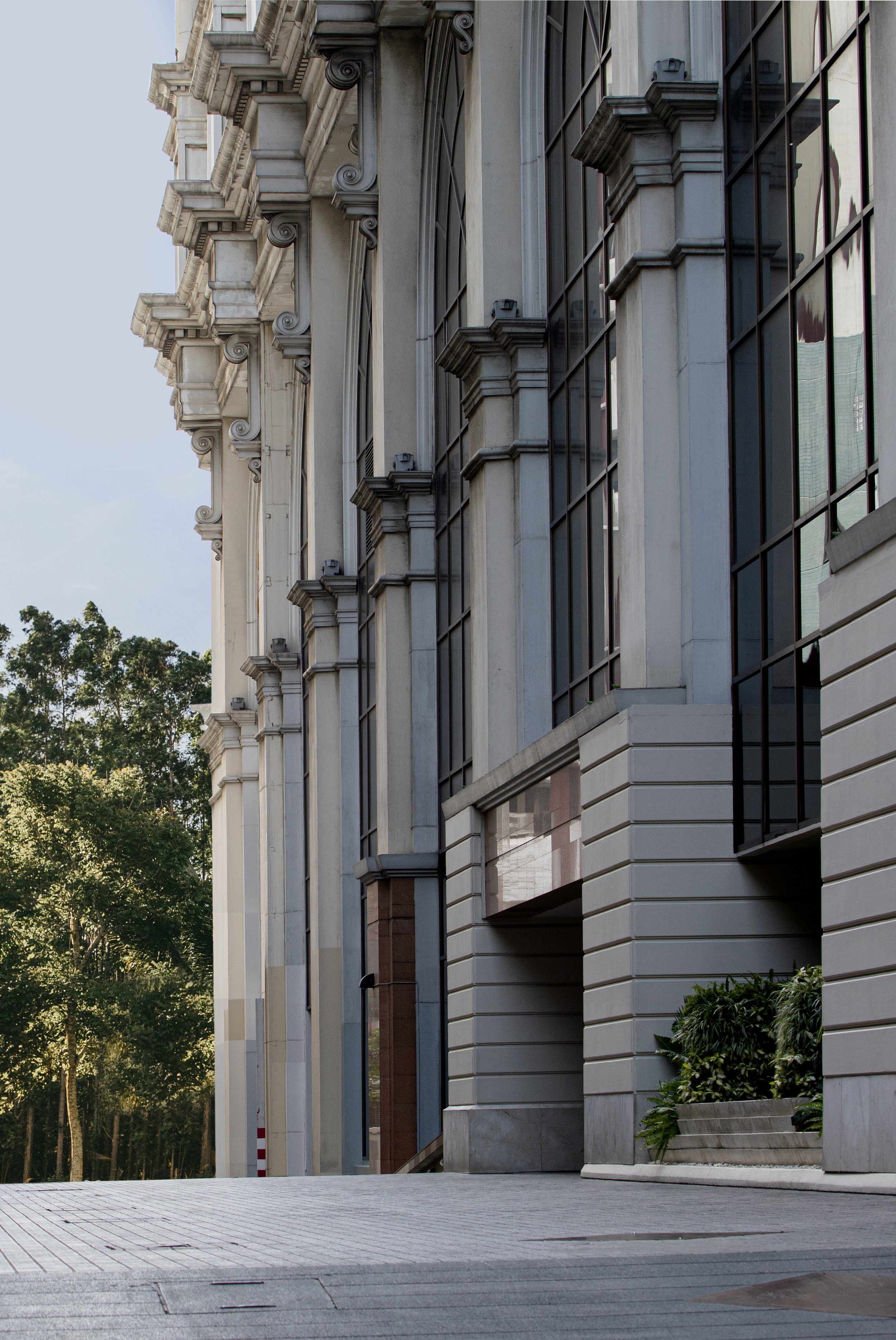
The original building was initially designed by Professor Rangsan Torsuwan in the early 1990s. The towering building is easily distinguished from the others by its thirty-meter-tall golden dome and the neo-classic balconies. A decade later, the renowned rooftop bars and restaurants were designed by dwp|design worldwide partnership, a global design company providing architectural and interior design solutions.
It is not only the building that is outstanding, but as well as the location. It is located in Silom, at the heart of Bangkok, where most of the magic of the city happens. With such a distinguished character – the colossal cream-colored building with the golden dome on its roof – it is impossible to miss. The bar has made a name for itself worldwide, being featured in one of Hollywood’s films, – The Hangover Part II.
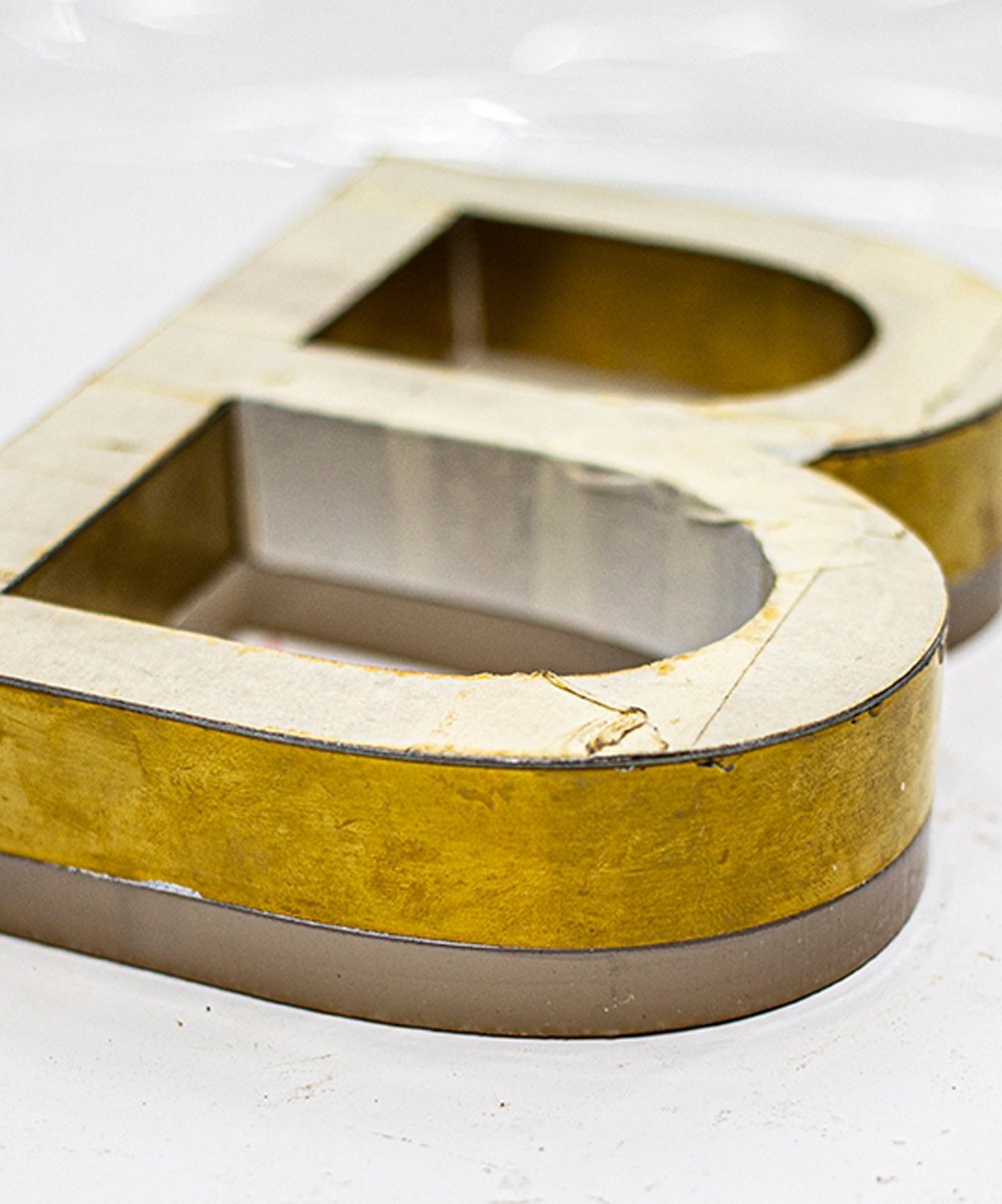
redesign new logo identity the existing brand in both informative elements such as directory signage systems and by collaborating with our Landscape and Interior partners.
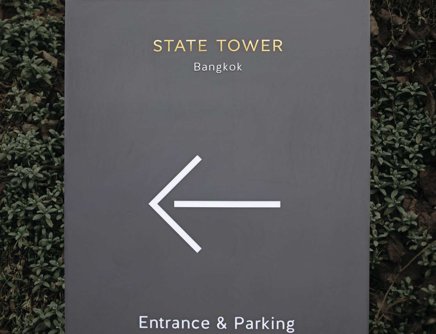
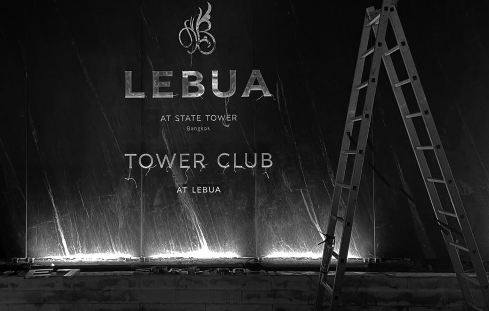
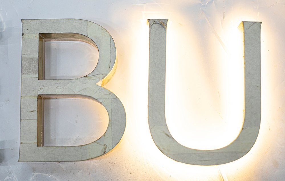
CASESTUDY’s involved in redesign new logo identity the existing brand in both informative elements such as Entrance signage, information wall, way finding, directory signage, and by collaborating with our partners; TLTD Landscape, Thitipan Piamsai/ Teerapat Chitramaikul as well as C&C, Chananun and Chanaichon Theeravanvilai on renovating the physical features.
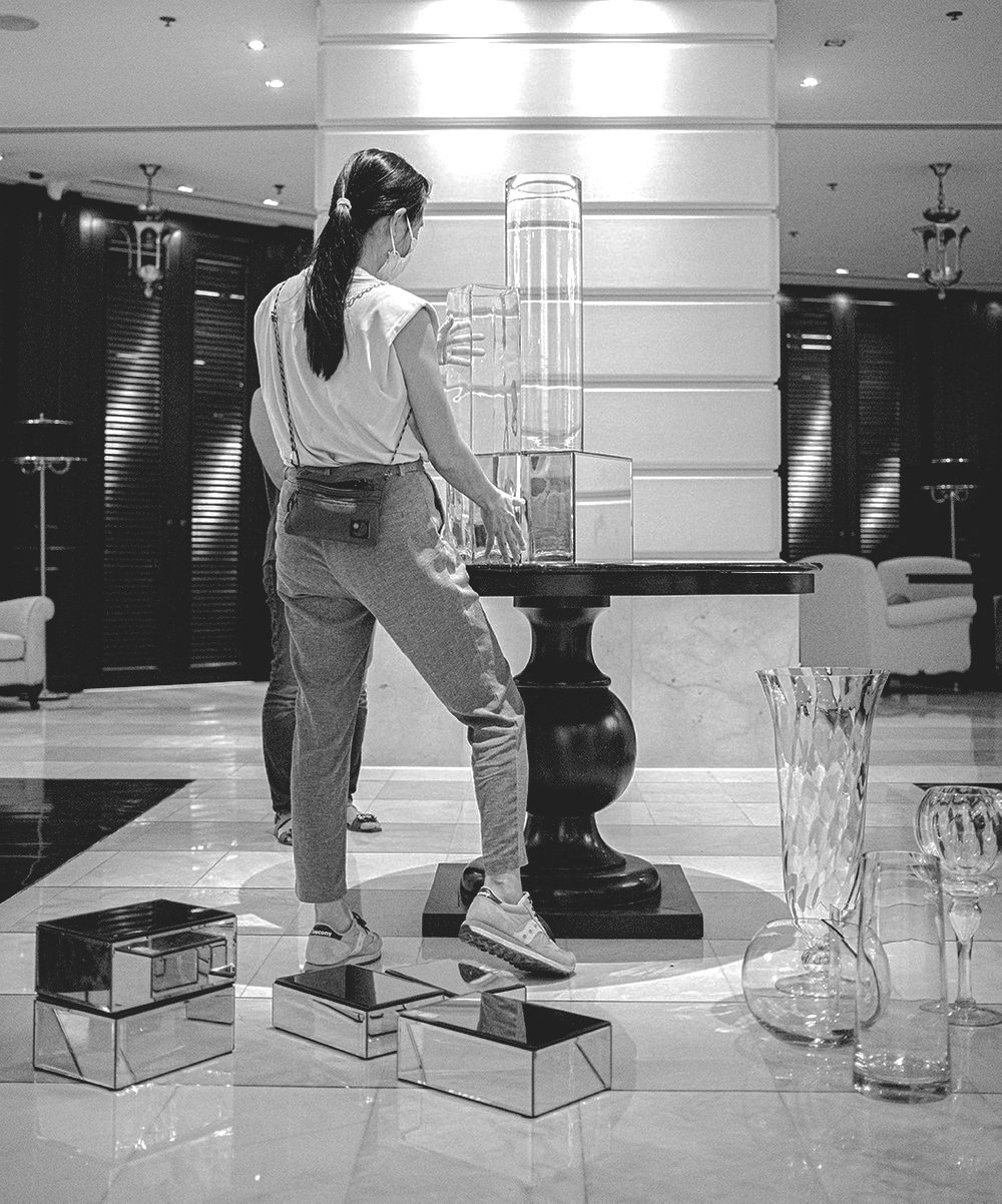
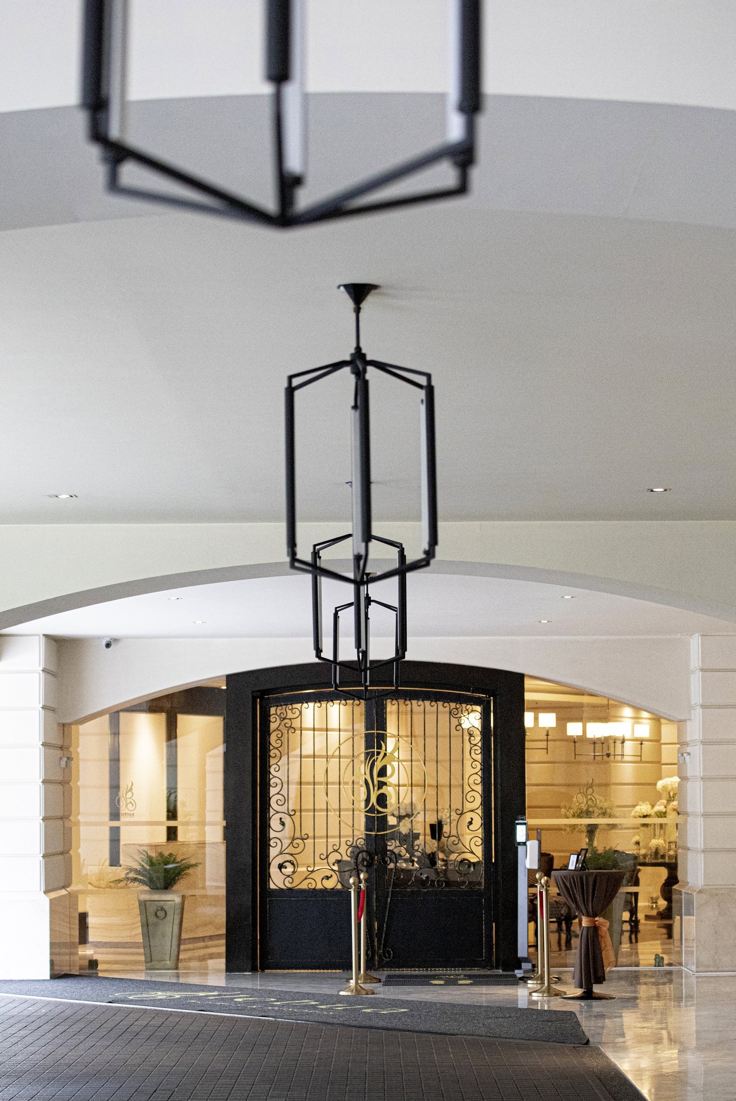
Starting from the street entrance, passing through to the lobby and continuously to the door-step of each venue. C&C’s renovation method was a combination of modernist rigours with a reinterpretation of neo-classic historic materials, decorative features, and color palettes.
Our common strategy was to keep the initial design characters but revolutionize to match the current trends, resulting in the sophisticated Modern Classic look with a sense of dramatic opulence.


